In this second of four posts about the design approach at Kisi, we outline how we planned, developed, and implemented a comprehensive design system called Laika. Click here to view our first post about the design of the Kisi Reader Pro
Recently at Kisi, we found ourselves in the unenviable position of a brand update.
As a growing business, there’s always a moment where you look at your brand — your logo, your colors, your design, and imagery — and you realize it’s time for an update.
Then you put your head on your desk and wish you never realized this.
Why did we do this to ourselves? #
Brand updates are difficult. Like, really difficult. They are time-consuming, require a ton of input, and can take a considerable amount of time to yield anything. Simply concepting and iterating a brand update can take as much time as actually applying that brand.
Right now, we’ve finished the iterations and arrived at an overall brand concept, and are transitioning to the roll-out of this new brand. There is a small twist: we’ve frontloaded our process to create a scalable and time-saving process on the backend.
We accomplished this by creating a comprehensive, custom design system called Laika. We wanted to take some time to explain what goes into a process like this, and how it might benefit your next brand creation or brand update.
What is a design system? #
First things first, let’s define what a design system is.
A design system is an entire framework for any design element for a specific project. In this conversation, the project is a brand.
Design systems, first and foremost, are comprehensive. They should cover most, if not all of the questions that pop up when designing something for your brand. This includes big things like logo styles, colors, and fonts, but also gets much more granular, including things like:
- Layouts
- Imagery styles
- Icon styles
- Corner roundness
- Web vs. print
- Email styles
- And on and on
Design systems are like a sacred text for your brand. They act as a single source of truth for anyone who works on visuals for a brand. They aren’t immutable: you can (and probably should) add to them over time, especially as you encounter more unique design scenarios.
About Laika #
Since this is our first formalized design system at Kisi, the team took a more conservative approach. Kisi has a brand that extends from product and software to partners and marketing, so developing a singular design system for the entirety of our brand was a task we decided to break up.
That's why we used our front-facing marketing brand as a sort of test flight. This primarily includes our core website, www.getkisi.com, but also influences things like email marketing and social media. The name we chose for the system paid homage to the idea of the first of its kind: Laika.
Laika was a dog that was among the first animals sent into space. She became the first animal to orbit the Earth, and paved the way for future manned expeditions.
As first of (hopefully) other design expeditions, we found the name Laika to be fitting for our first design system and favorite pet project.
The following outlines the goals we achieved using the new system:
Goal #1: Scalable branding #
If you’ve ever created a brand or carried out a brand update/rebrand, you are familiar with the difficulties. Branding is not always an objective process, and applying a new brand brings a lot of feedback loops that complicate and extend timelines.
There is another wrench that inevitably gets thrown into branding projects: can the brand be applied as it was originally visualized?
Designers can create amazing ideas when there are no limits. The reality is that many of these designs have to be applied in an interactive space that is created by developers.
With Kisi, we knew we had to create something that was scalable both in the design and development space. Something that removed most of the subjective feedback loops that plague branding efforts while making the application of designs scalable across a variety of use cases.
Unifying design and development #

The need for a design system that is scalable for both design and development meant that André Brdoch, Web Developer at Kisi, had to work very closely with Kisi’s Digital Art Director Oskar Huberhoff.
“Design systems are not all about design,” Oskar says. “They’re like a bridge between everybody that works on developing products.”
Building this bridge required a lot of collaboration between Oskar and André. The two spent days both in person and virtually, working through the skeleton of Laika in Figma and looping other members of the team in via Discord when additional feedback was needed.

One of the most important things for them early on was to establish a vocabulary that allowed precise communication and documentation.
“Documentation was a collaborative process,” Oskar says, noting that they could not move forward without being sure they understood each team’s goals.
“Designers are more of the chaotic type. Anything goes,” André says. “Our tasks as developers is to identify the underlying order and formalize it in the form of code.”
Oskar gives his perspective on this: “The ideal setup is to be able to explore in more abstract ways when it comes to design, and then finalize it with structure from the developer, formalizing the output.”
The two knew that to create a successful, scalable design system, they had to focus the chaotic creativity of design with the functional order of development.
Goal #2: Freedom over oppression #
A design system, as defined, runs the risk of limiting the overall creativity of a designer. “Design systems have the potential to be oppressive,” is how André puts it.
“They can be bad for creativity,” he adds. “But that’s indicative of a bad design system.”
Oskar elaborates, saying that a good design system, “just puts creativity in context.” The framework of a design system isn’t about limits. Instead, it’s about consistency and cohesion.
“You can look to them for inspiration instead of just rigid guidelines,” Oskar says.
Organizing your framework #
The basis of a design system is the framework: the overarching hierarchy of elements that influence design. There are categories within this framework, ranging from very broad concepts like color or font styles, down to very precise ideas, such as hyperlink and button styling.
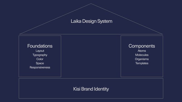
At Kisi, we broke these ideas into two main categories: Foundations and Components.

Foundations are the general rules of our design system. Layout, typography, color, space, and responsiveness. These are the basis for the approach when designing components within Laika. Color for example is company-wide and is true to the Kisi brand identity, where typography is limited to the sales and marketing side.
Foundations leave a lot of wiggle room because they are meant to be less about granular rules and more about the overall feel. They also help create cohesive design elements by establishing themes that ensure optimized color palettes.
Components are more strict and functional elements within the broader ruleset of foundations. The basis for our components is based on the concept of Atomic Design. This breaks components into a hierarchy, with atoms being the smallest and templates being the largest. Atoms make up molecules, which make up organisms, and finally, result in templates.
Components include :
- H1, H2, H3, and body text styles
- Buttons
- Accordion image sections
- Video and motion graphic elements
Components can change and be added to over time as more design use-cases are encountered. They act as your living library of design elements, and shouldn’t be treated as immutable or static.
Goal #3: A unified brand experience #
The final goal for the Laika design system was to plan a way to create a unified brand experience from the perspective of anyone interacting with our marketing.
To accomplish this, Oskar took the original brand identity, created by his predecessor Emil Rosenberg, and applied it to the public-facing website of www.getkisi.com. This required taking the Kisi brand identity and creatively applying it to the living, interactive space of getkisi.com.
This allowed the interactive web experience with the Kisi brand can be unified and cohesive. And by carrying certain elements of Laika to our email marketing and social media, we are able to create an even more holistic brand experience.
The best thing you can do for a brand is hone its identity in such a way that users don’t necessarily need to see your logo or company name to know what brand they are interacting with. A good example of this is Disney-Pixar movies. You don't need to see the open title screens to know when you're watching a movie from that studio.
When you can communicate your brand through the most basic design elements, you’ve created an effective design system.
How can our experience help you create a design system? #
The process of creating Laika was, for us, very involved. It required near round-the-clock devotion from two people as well as consistent input from several more.
The reason we’re sharing this experience is the hope that it can help other individuals or teams set out with a solid plan to tackle their design system.
There are plenty of challenges we experienced along the way and plenty more that may crop up over time. If you can the experiences and insights we laid out here and use them, that’s great. If you have any more specific questions about design systems, we’d love to hear them.

Scott Mitchell
Content marketing strategist with specializations in IT and managed services.


