Imagine that you are visiting a new house that you have never been to. You may have seen it up close or from far away, or perhaps you have heard about it before through some friends or relatives. Perhaps this house is cluttered, or the entrance of the house is unnoticeable. Maybe the functionality and architecture of the house are simply confusing. What if this house is the brand of a company? What do you do?
Let’s review three essential aspects of a brand identity:
- Foundations
- Crafting a system that works within a specified framework
- Orchestrating the pieces together while maintaining it
The industry #
Looking at the access control industry today from a corporate identity and branding perspective, it is fair to assume that most brands live on old merits, only focusing on growing their product portfolios.
While the technologies and solutions prosper, the brands’ stories are neglected. Some might argue that the product is the brand's story. But how the products are presented is also an essential factor in brand positioning.
The industry rarely tells the story from the products’ benefits side and how they can impact people’s lives and enable new experiences for their spaces.
What we do leaves an imprint on the audience, whether it's typography, imagery, or significant customer support. A holistic experience.
Connectedness #
We all live in a continuously changing, digitally connected world with ever-growing security requirements. Having a space in which we can feel secure is a basic human need.
Modern times usher in new solutions and capabilities. Every obstacle brings opportunities for creating solutions. Workspaces traditionally used to facilitate manual labor turned into flexible, scalable spaces that can adapt fluidly.
The predictability of the past made our spaces secure. Today it is different.
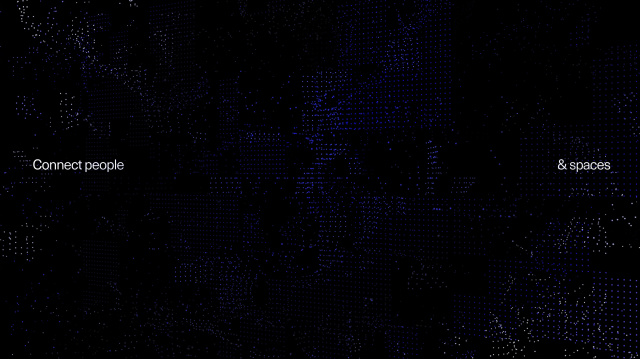
We need to be agile and stay connected. It’s no longer only about keeping intruders out. It’s about letting people in. Connecting people to their spaces.
Defining the foundations #
Every design system is different, yet it usually serves a common purpose – to systemize and scale the selected input across multiple variables. Typically you can find design systems for corporate identities. However, design systems can also have more specific environments, such as software.
In the digital age, design systems may also incorporate movement (such as bezier curves for animation). There was a time when a scalable identity was carefully crafted at a table, with pen and paper and math. A balance between the rational and the abstract — a search for timelessness.
At Kisi, we maintain our foundations on a functional hierarchy – 80% timeless, 20% expressive.
Foundations #
The foundations ensure that the system in place works as intended. In our visual identity, our foundations consist of layout, typography, color, tone of voice, conceptual framework, and sender (logotype).
These are our essential components. The rest is split up between imagery, motion, and graphics. The graphics and imagery help set the identity’s tone and visual direction.

In the beginning, foundations have no knowledge of each other or connections between them. They are agnostic to each other—meaning they don't understand the connections between them.
Color is just a set of colors. Typography is just a typeface. Spacing is just de-activated white space. The foundations need to be activated to introduce scalability and explain how they work together in specific environments.
Questions need to be asked and challenged.
Activation
The concept of 'connect people and spaces' fuels the Kisi brand and design. The idea inspires the creation of something new, something better, something incredible. To connect is to explore the space between two separate elements.

The space between light and dark.
The space between warm and cold.
The space between dynamic and static.
The space between emotional and rational.
The space between organic and mechanical.

Our symbol is the visualization of the concept of connection. It links two disparate elements together — people and spaces.
Seeing things with a new perspective #

Logotype #
By encompassing our vision into our DNA, we have activated our purpose, which is encapsulated within the Kisi logotype. Our blue color acts as a gateway to our technologies and the solutions we provide. Our new color is fit for the digital era. More contrast, better impact, more clarity.
Sender system
Placing the logotype can be a challenge. A sender system is a designed framework that helps to maintain the consistency of the logotype with the placement.
Fast-paced environments require flexible and adaptive solutions. Our sender system delivers both. The grids change depending on the medium, which creates an opportunity for distinguished and playful compositions to be made.

Color #

Our color palette enables us to form our visual language, which combines information, color, design, and purpose. We use our primary colors together with our accent colors to create expressive but accurate compositions which stay true to our brand.
Tints give us more accuracy and expressiveness when needed, depending on the purpose and execution. The warmer colors act as a gateway for inclusiveness, contrasting against the colder accents, which resemble technology in our modern world.
It enables us to create meaningful palettes for different purposes. The refreshed look for our dashboard and mobile app we launched recently is a good example.

Purpose #
With a purpose, our tools, research, analytics, explorations, and discussions become worthwhile. Why are we doing this? Where are we going? What are we striving for? What is the idea?
Sometimes there are many questions but only one answer, and sometimes there are a lot of answers but only one question. We put in a lot of effort and research during our rebrand.
We asked ourselves, what do we do? What happens if we zoom in on the very outcome of our company, trying to understand and see? Diving beneath the very last layer.
We connect people to their spaces. This is what our technology and solution do. We do this as a company, employees, pioneers, and people.

We act on it. We let it fuel our design, brand, and products. We are inspired by it. We empower it to inspire.
“Designing is not a profession but an attitude. Design has many connotations. It is the organization of materials and processes in the most productive way, in a harmonious balance of all elements necessary for a certain function. It is the integration of technological, social, and economical requirements, biological necessities, and the psychological effects of materials, shape, color, volume and space. Thinking in relationships.” — Laszlo Moholy-Nagy
Organization of things #
Constantly exploring spaces, we spend a lot of effort on layouts. For us, spaces, typography, and layout go hand in hand. Today there are a lot of different canvases, like billboards, posters, television, desktop, tablet, and phones.
All of these have their own available space. Some are horizontal, others are vertical, and some are hybrid. For us, it is important that we spend time and effort in understanding and securing spaces.

By using our own space array and typographical scale—we can build out layouts effectively and accurately across different mediums, whether it’s printed matter or digital environments.
Making sure the architecture works #
Brand and design ownership #
The fast-paced digital era constantly confronts us with excellent, good, and not-so-good design. And it's not so much up to the company to decide if something is truly remarkable—it is up to the audience.
That’s why it is critical to have ownership of the brand, branding, visual identity, and the design of the products. Usually, the products are what make the company.
However, the visual appearance of the company is equally important. It is there to help to tell the story that we invest countless hours in at the table. Analysis, research, and go-to-market strategy.

How do we tell the story? And what is the story going to be about? What is the idea? What are we trying to archive?
Concepts like these make it easier to communicate the purpose to the people. If the purpose is well defined and communicated, we can activate it through all the channels—with the visual appearance and design system.
Having ownership and continued development of the brand identity is critical. In the end, it is also a product.
Live by your system #
Having a design system in place helps to position the brand, together with strategy and suitable marketing decisions. It enables the creation of modern web design, communication, motion and animation, color, software, and hardware. It also guides our written and verbal communication, doing great presentations and really capturing the essence of the company – to embody the vision and mission.

Economic factors #
Crafting a system requires time, analysis, and plenty of brainstorming. It is important to note that while creating a system takes time, it diminishes the time spent on projects in the future. For example, in our digital environment, we have a system that gives us aid in creating web pages, together with design, development, and copy.
By having the Laika Design System in place, we can spend more time brainstorming the purpose of new content and concepts.
Components for success #
Every brand is different. Every brand has its own story to tell, its own peculiarities, stakeholders, and audience. For some brands, it's about the idea over the product or vice versa.
At Kisi, we think holistically about what we do. With our values: Forward, Human, Trusted, and Responsible, we fuel our ambitions to deliver the best quality products and solutions. However, we also understand that what we do is unique to us—and so is our story.

Relevancy and uniqueness
Adding relevant elements to a brand is essential for building brand sentiment and trust. How do you know if you are stepping out of line or need to push the boundaries more? Anything can be relevant — knowing what it is for the brand, however, is the key.
By creating experiences, ideas, projects, or concepts relevant to us as a company, we are staying true to ourselves. And for us, that is unique. We trust ourselves and act upon our conceptual framework of connecting people and spaces.
Telling the story
Telling contemporary stories is essential to building a recognizable brand. It is a significant enabler for creating brand experiences, showing the journey, and developing new ideas. It adds credibility and trust to the brand. Telling stories goes hand in hand with brand and design ownership.

Moving forward #

We'll reshape physical security in ways we can’t even begin to imagine. We have our mission and vision, values, foundations, and system to rely on. We know that we are on a path to something truly remarkable. We are continuing to develop new concepts, a better customer journey on our site, and improving our foundations.

Oskar Huberhoff
Designer based in Stockholm, Sweden